
Government services should be consistent, so users don't have to learn a new interface every time. Point 13 in the Digital by Default Service Standard says:
Build a service consistent with the user experience of the rest of GOV.UK including using the design patterns and style guide.
It also means that service teams don't have to reinvent the wheel - we can share our research and find out the easiest way for a user to understand or achieve something.
Point 1 in the Standard says:
Understand user needs. Research to develop a deep knowledge of who the service users are and what that means for the design of the service.
User needs come first. The design patterns and style guides are there for consistency, and a solid starting point, but services can and should improve on guidance where needed, based on user research.
The design patterns and style guide have proved a solid base for us. For example, typography is large and clear, and ‘one thing per page’ keeps things relatively straightforward for our users. However, we’ve found some areas where - based on our research with users - we think we can better meet our users' needs in slightly different ways, particular to the service we’re working on.
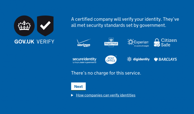
Introduction slides
Users don't know what to expect of GOV.UK Verify - proving your identity online through a certified company is a brand new concept to most people. They would be on GOV.UK to do something else (claiming a tax refund, for example) and then be asked to verify their identity using GOV.UK Verify. They need to quickly understand the process and have confidence in it in order to complete their task.
One solution we tested was a video introduction to GOV.UK Verify. However, our user research and analytics showed that people tended not to watch the video, and we replaced it with introduction slides (one of which is pictured below).
Avoiding contractions
The style guide recommends using contractions, such as ‘they’re’ or ‘shouldn’t’, as language like ‘should not’ can seem formal. In our research, however, we found people would sometimes misread some types of contractions like ‘don't’ and ‘can't’. This was a serious problem as they could end up making the wrong decisions in the interface. This could mean, for example, that they end up at a certified company that can't verify them. Using the long form of ‘do not’ and ‘cannot’ makes the all-important ‘not’ clearer, and prevented these mistakes.
Heading text
In general, GOV.UK uses large, bold headings for pages. For GOV.UK Verify we found that, in some situations, using the same text size and weight throughout encouraged people to read more, instead of focusing on particular elements and skipping others.
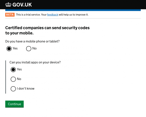
Previous design with a large, bold heading
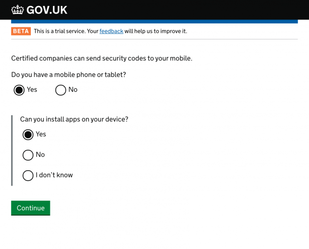
New design with headings the same style as body text
Large radios and checkboxes
The recommended design for radio buttons and checkboxes is to use large, solid labels in order to increase the obvious area you can click. However, in our research people still generally try to click the element itself, which is very small. Therefore, we've made custom large elements which are easier to click - you can see these in the screenshots above. The recommended pattern does make the elements larger but with CSS, which is not supported by all browsers. We feel it's important to try and help all users.
The service manual has been hugely helpful in designing GOV.UK Verify. It has loads of useful guidance, backed up by wide-ranging research with users of various services. Where we've departed from the guidance and used new design patterns, we’ve done so on the basis of in-depth user research. Stephen Dunn, our service manager, has written about how we'll continue this research in the run up to live in April and beyond.
Update, 11 July
The above post was published before our live Digital by Default Service Standard in April 2016. During our assessment, we presented our findings on heading text with the assessment panel, and we thought we’d update you following that discussion.
We agreed that although there was evidence that bold headings were causing a comprehension issue in GOV.UK Verify, we hadn’t exhausted all the possibilities of designing with the headers in place. As such, we’ve reverted to be consistent with the GOV.UK design guidelines in this case, and are continuing our research to better understand this issue. We’ll blog again when we have the results of this research.
For those interested in the ongoing development of GOV.UK Verify’s design, we’ve placed the introduction slides pattern on the cross-government design hackpad. We’ve also added a proposed pattern for a screen shown to users to provide information before they start a process.