Last month GDS had a week of activity around accessibility. This included blog posts, Q&A sessions and Periscope interviews on Twitter, hack days and community meetings with colleagues across government. Inspired by this, we thought we’d share some of what we’ve learnt conducting accessibility research for GOV.UK Verify.
GOV.UK Verify is the new way to prove who you are online when accessing government services like viewing your driving licence or filing your tax. Having just gone live, GOV.UK Verify will be constantly improved and expanded based on user feedback.
During public beta we reviewed the service as a result of research with users with a range of disabilities. Our most recent round of accessibility research took place in March. We were keen to find out more about what the latest iteration of GOV.UK Verify is like for users with different disabilities, and how we can make it better.
We conducted 9 research sessions with people who had a visual or motor disability, or who had dyslexia. We went to the participants’ homes, so that we could understand the context in which they use the internet - and online government services - more deeply. This also meant that we could see any assistive technology exactly as the participant used it in real life.
With a better understanding of users’ accessibility needs, we can remove barriers - or, even better, make sure those barriers don’t exist in the first place. We learnt 4 things which are relevant to designing government services for all users.
1) Things that seem small can have a big impact
There are different ways of using a screen-reader to quickly get an overview of the important content on a page, rather than having to listen to it all in sequence. Often people using screen readers do this by skipping through sections that the screen reading software identifies using the header tags in the code. However, we realised that some of the pages in GOV.UK Verify don’t use headers and titles consistently. Many browsers don’t even show the title of a page, so it can be easy not to pay it much attention as a sighted user. But for participants using screen-readers it meant that they could not always find the most important content on the page.
Another example of something seemingly small creating big problems was in instances where buttons were not labelled in a way that clearly indicated their purpose. Sighted people often use visual cues to understand the function of a button, such as its colour or placing on the page. For blind users the label of the button is much more important.
2) Prioritise research and design for mobile and tablet
Smartphones and tablets can be hugely enabling for those with disabilities. Several participants said that they rely heavily on their mobile or tablet, sometimes to the extent of never using a desktop computer to access the internet. For those with visual impairments, these devices come with accessibility functionality built-in. This is appealing in comparison to very expensive screen-reading software for computers. A participant with rheumatoid arthritis said that he never used to use the internet at all, until his children bought him a tablet. This is easy for him to tap and scroll, without needing the fine motor control that is required for using a keyboard or mouse.
This is a great example of accessible design benefiting everyone. We need to do more research on improving our mobile journey on GOV.UK Verify, for example by including a mobile or tablet journey in each research iteration. When we do, it won’t just benefit those with disabilities.
3) You can’t do accessibility in isolation
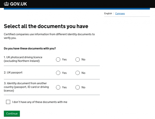
We found that features we had refined in response to research conducted with users with no disabilities actually caused significant problems for those using screen-readers. For example, we ask users to tell us which documents they have on this page:

Here we give users the option to check a box to say that they don’t have any of the documents. This was specifically designed so that users without documents are able to continue, rather than thinking the process won’t work for them. However, this design was extremely confusing for people who cannot make use of the visual logic. The checkbox question does not sound significantly different to the Yes/No radio buttons to someone using a screenreader. Therefore, these users don’t understand what the question is for, or want to be given the option to say ‘yes - I do have documents with me.’
In designing something that works really well for the full range of users without access needs, we had inadvertently put obstacles in the way for those with sight loss. This emphasised that research and design for accessibility needs to be part of continuous iteration, rather than something you take stock of every so often.
4) Build an accessible service, not just an accessible website
The issues we observed went beyond usability. The GOV.UK Verify journey varies depending on what identity documents the user has to hand. There are many possible journeys and they vary in how accessible they are. For example, sometimes users have the option to take photographs as part of the verification process. In our research this was impossible for users with visual impairments to do this without help.
We are always working with certified companies to improve their user journeys and introduce new methods of verification, so that they suit people in all kinds of circumstances. As the range of possible journeys increases, we need to make sure users are able to choose a journey they are able to complete without assistance.
There’s work to be done
Just because more than half a million identities have been securely verified through GOV.UK Verify and thousands of people use it each week, it doesn’t mean we’ve done all the work. Iteration with accessibility in mind will be central to our ongoing development.
We have already made a number of the small changes following our most recent round of accessibility research that will make the GOV.UK Verify journey much more accessible for screenreader users. For example, we have improved our mark-up and have made headers and titles throughout the journey more consistent and meaningful.
We will be taking each of the lessons above further. Beyond the changes already made, we want to: incorporate accessibility into our regular research and design work; conduct further research on mobile and tablet journeys; and review the full service experience to uncover and understand any challenges it presents for users with disabilities.
To keep up-to-date with GOV.UK Verify's development, subscribe to the blog.

2 comments
Comment by Ash Choudry posted on
"thousands of people use it each week" is only part of the story - how many people try to use it and give up in frustration?
Comment by Rebecca Hales posted on
Hi Ash
We publish our verification and completion rates on our service dashboard: https://www.gov.uk/performance/govuk-verify